VERANDA DECEMBER 2023
This Whimsical Home by Chauncey Boothby Features a Turreted Playroom and an Enviable Wine Cellar
Written by Lauren Wicks | Photography by Read McKendree | View Article
The property was reimagined as a playful paradise that’s ideal for entertaining people of all ages.
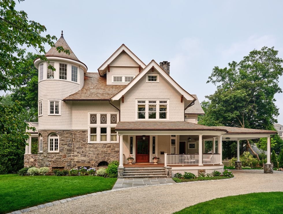
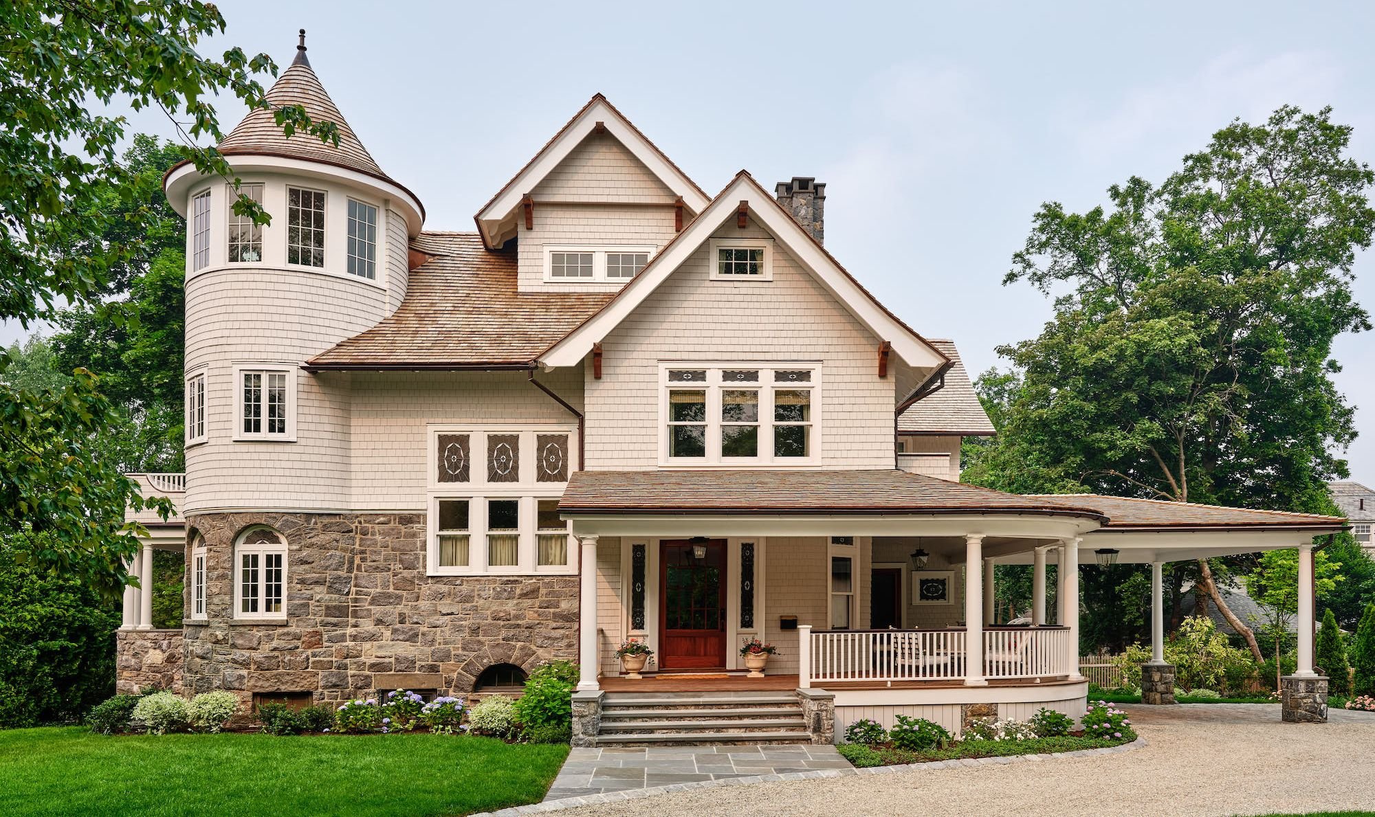
When a repeat client reached out to Connecticut-based designer Chauncey Boothby about taking on a full-gut renovation of their new house in Larchmont, New York, the designer was excited for the challenge.
Then she found out the family who purchased the client’s former home wanted it fully furnished. Of course, this was quite the compliment to Boothby, as she also designed that property, but it meant that this new home would be a fresh start in more ways than one.
However, the designer says between the clients’ flexibility, their trust in her, and their willingness to “camp out for a while,” Boothby was able to create something quite extraordinary that the young family will cherish now and for years to come.
“The couple has two young girls, so it needed to be a space that worked well for them and fit with their love for entertaining,” Boothby says. “It’s an old house, so we definitely wanted to keep to that aesthetic but basically every room needed renovating. Thankfully the previous owners had done a beautiful job restoring a lot of the traditional elements, so we didn’t have to make drastic changes.”
Boothby teamed up with Paul Kramer of Homes By Kramer, who worked with her on the clients’ former home, to give the bones of the home a fresh chapter, from restoring the original flooring to reworking the fireplaces.
They decided to keep the beautiful existing windows that had been well cared for, while areas like the third-floor playroom and basement received a complete refresh to create idyllic retreats for both the kiddos and the adults.
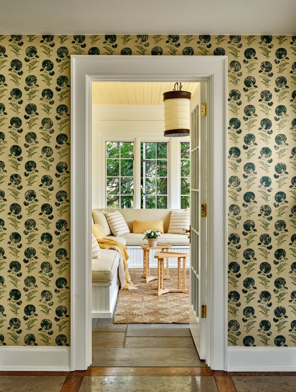
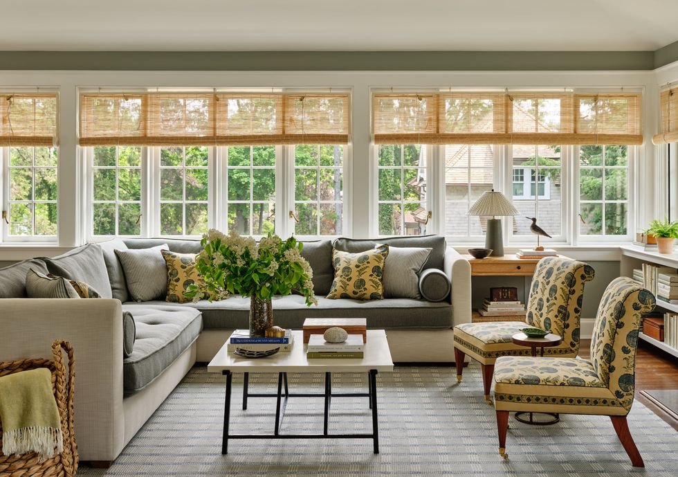
A beautiful Indian flower motif finds its way into the sun-drenched family room. The area rug is Elizabeth Eakins. J&J Upholstery created the custom drapery in this space and throughout the home.
Read McKendree
However, Boothby and Kramer had to employ some serious intentionality into their renovation plans, as the family lived in the home for the duration of the project—nearly two years—which the designer says offered the challenge of figuring out how they could best live in the space while all the work was being done.
Naturally, the top priorities became the first-floor living areas and the bedrooms, which ended up being the perfect launching point for Boothby’s colorful visions for the home.
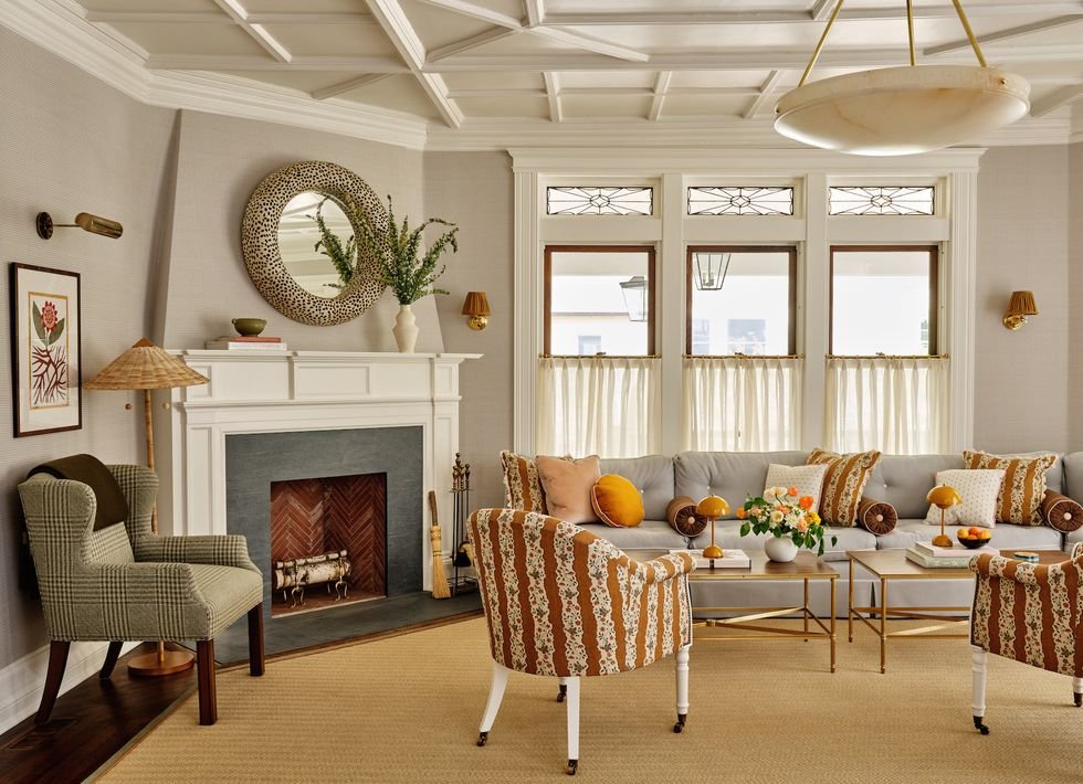
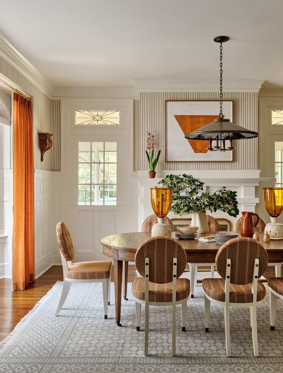
“The color palette travels nicely through the house," Boothby says. "We started with a much more sophisticated look on the first floor with the colors all playing off one another, and it gets more and more playful as you go up to the second and third floor while the basement is more refined for the adults.” She adds, “The living room was our starting point because it acts as an entry too, and I wanted it to feel like a parlor, and that really inspired the look of the rest of the house.”
Boothby has a penchant for mixing color and pattern that’s arguably Anglophilic, and she utilized an array of U.K.-based vendors, from Soane and Liberty to Charles Edwards and Susie Atkinson.
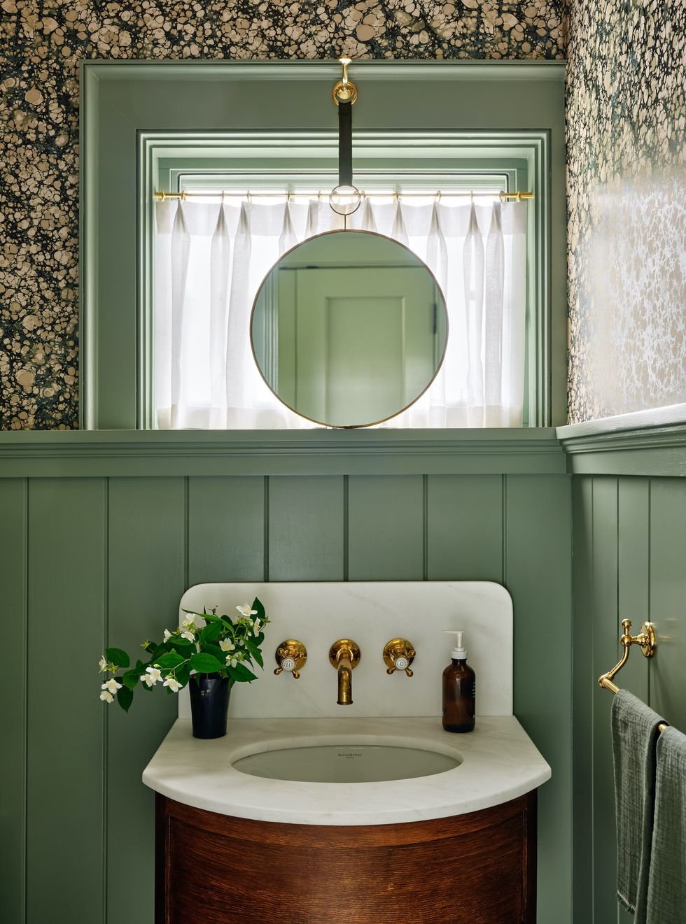
While each room has distinctive color stories and purposes, it all flows together with delightful pops of green—Boothby’s signature color and a nod to the gorgeous environment surrounding the family's home.
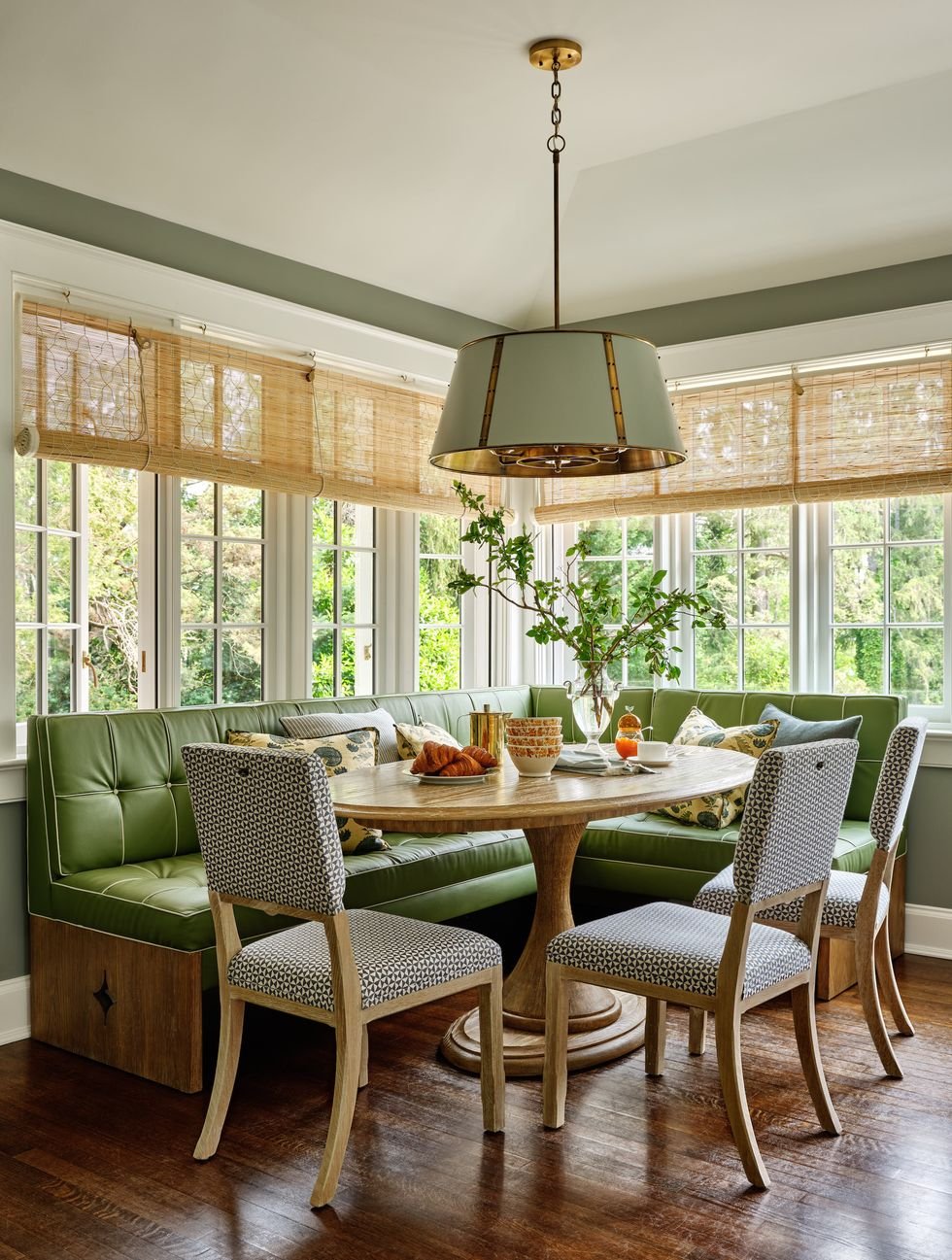
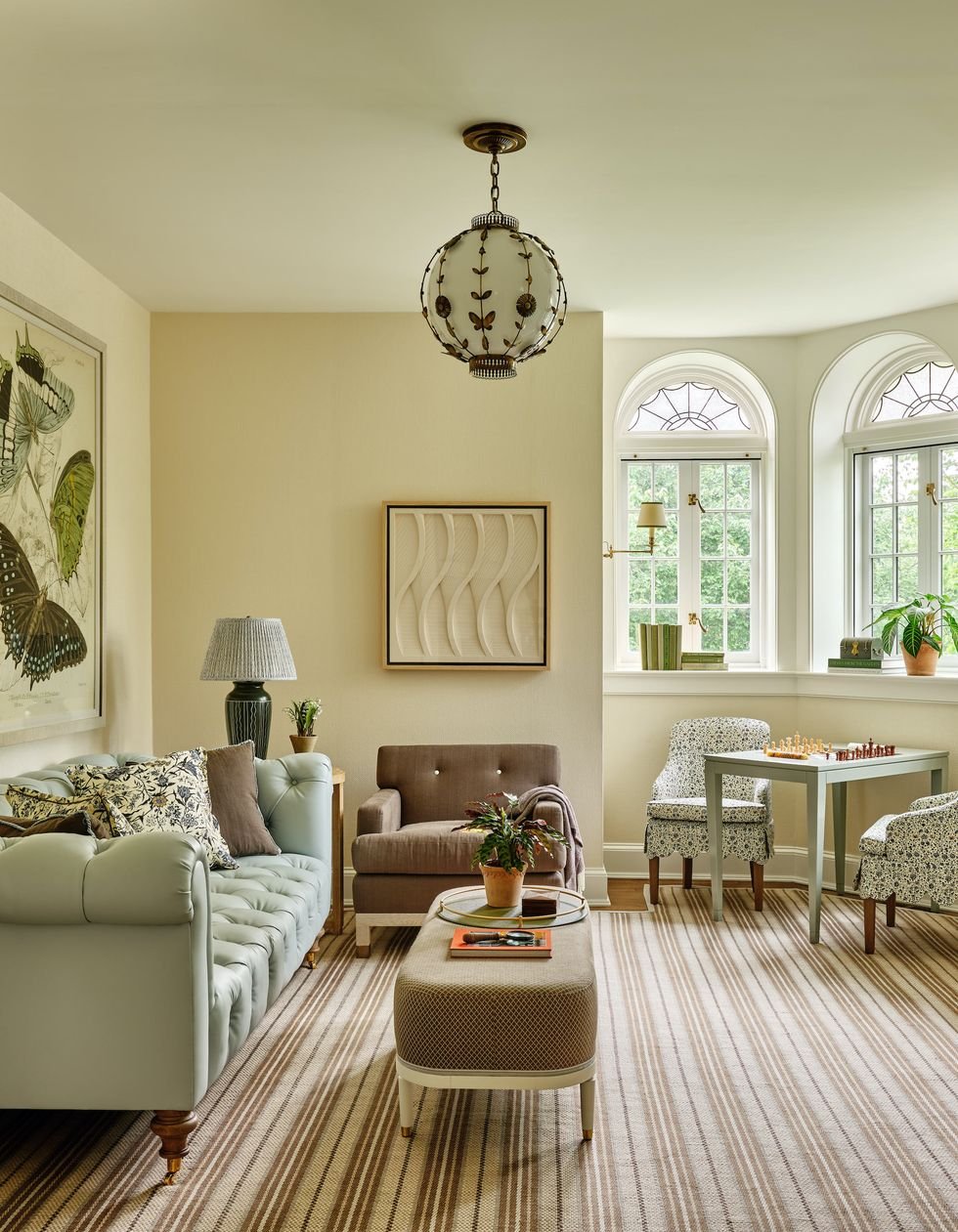
“I always see green as a neutral, and you’ll notice that a lot, particularly in the study space-slash-game room, which is more moody with browns and greens that’s balanced with the pretty playful blue, as well as in the family room with all the beautiful windows that reflect the beauty outside,” says Boothby. “The greens inside reflect all the amazing greens outside.”
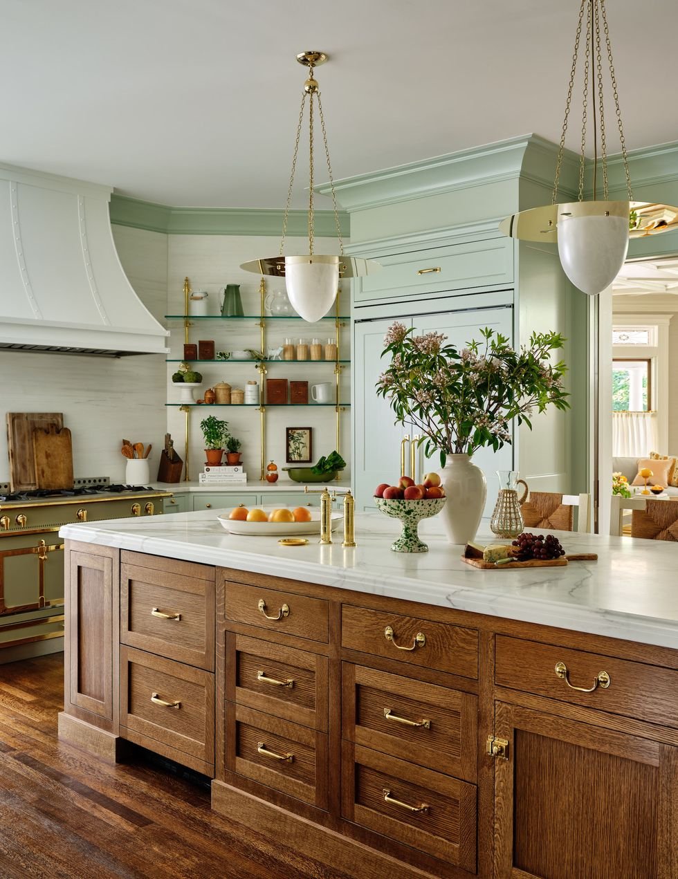
Bistro shelves from Urban Archeology offer a striking destination to display the owners’ favorite serving pieces. Hector Finch light fixtures act as their own little works of art while the La Cornue range is the star of the show.
Read McKendree
Once Kramer and Boothby had reworked the essential spaces, the fun really began as they tackled a full gut renovation of the basement and architecturally reworked the third-floor play area.
While the generous basement bar feels like stepping into a chic restaurant in nearby Manhattan and the wine cellar is something any oenophile would covet, the play area is an unabashed girly girl’s wonderland that feels like entering into a British Barbie dream house.
Boothby and Kramer took two adjoining third-floor rooms to make one giant space for make-believe and movies, and they even created a charming turret to up the playful, cozy vibe.
“I was so happy with the way this space came out and was pretty proud of how we dealt with it without an architect,” says Boothy. “There was lots of patience and head-scratching, but I am so thrilled with the way the playroom turned out, and I know the clients and their little girls are too.”
The playroom, along with much of the rest of the home, is a testament to Boothby’s determination, especially when it comes to customization. She says that “nothing was easy; everything took a while,” but the end result made all her creative tinkering and agonizing over lead times well-worth the hassle.
Plus, Boothby says she’s thankful for the amazing vendors she’s found in J&J Upholstery, Holland & Sherry, along with many others that helped bring her visions to life, even when they required uphill battles.
“Kids’ spaces are some of my favorite because there’s so much you can do with them, and you have to be able to create a space that they can grow into while feeling playful too, which I think is a reflection of my aesthetic,” says Boothby. “I love classic and clean, but it needs to have a lot of fun colors and quirkiness. What I love most about this house is that it is sophisticated with the right amount of whimsical elements."
Step Inside This Larchmont, New York Home
