Wall Street Journal July 2021
How to Design Kids’ Rooms They Won’t Outgrow
Written by Alison Van Houten | Photography by Read McKendree | View Article
SOON after Chauncey Boothby was tasked with outfitting a toddler’s room in Chappaqua, N.Y., the designer happened upon a lithograph by author and illustrator Ludwig Bemelmans. In the artist’s playful but urbane style, his waggish heroine Madeline confronts a tiger in a tented cage—ideal inspiration for an interior designer working to marry whimsy with a sophistication that will carry a young child named Maddie, now 4, into her tweens.
The resulting en suite bedroom is one of the cheerful refreshes Ms. Boothby, based in Rowayton, Conn., has been asked for lately as young and old attempt to shake off the last 16 months. Home-study areas in particular, she said, had “been shrouded in a veil of dread.”
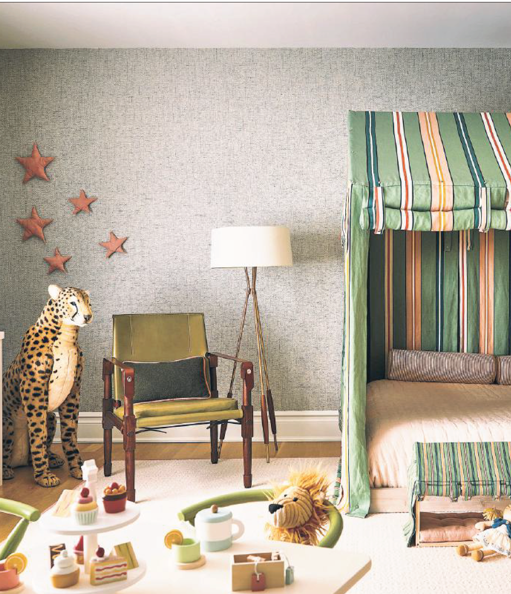
Ms. Boothby made a happy leap from the palette in the Bemelmans work to Ottoline’s Sporty Stripes fabric, which she used to canopy the bed and upholster the desk and window seats. “Bringing in some of the darker greens makes it less totally childish,” she said. The most juvenile elements—a modern tea set, cutesy animals and puffy corduroy stars pinned to the wall—can easily be swapped out as Maddie ages.
Here, Ms. Boothby’s other strategies for straddling the taste of tots, tweens and, let’s be frank, adults.
Animal Attraction
The fabric canopy that Ms. Boothby’s upholsterer produced for the bed’s 4-year-old tenant was inspired by “the old-fashioned zoo tent” in the Ludwig Bemelmans print that hangs over the desk (below). Charged with kitting out a room that can evolve with its young occupant, Ms. Boothby created a sanctum she “definitely could see a tween or teen lounging on.” Other all-ages elements include a midcentury-style tulip side table and cleanlined brass lighting with simple, solid shades, plus the walnut chair by Richard Wrightman, which the clients already owned. “That doesn’t scream child,” said Ms. Boothby, but its olive leather and its safari style tie into both the color scheme and wild-animal theme.
End of the Rainbow
The Bemelmans litho that sparked the room’s stripe-y design hangs against Japanese paper woven in sobering tones of gray. The clients had asked that the space not be too girlie, and the wallcovering, a holdover from the suite’s life as guest quarters, worked as a neutral background. Colors in the artwork and stripe textile include pale pink, found in the accessories; pear green (the desk); and orange (the metal lamp shade). Limited ornamentation, like the scalloped lamp shade and fluted cup, helps maintain a balance of serious and saccharine. Ms. Boothby gave each of the room’s many animals, like the zebra lamp and tiny felt lion here, its own little moment, as if it was “on display at the zoo.”
Tassel Castle
In the bathroom, Ms. Boothby contrasted blush finishes with a forestgreen cabinet and emerald-hemmed towels that are embroidered with orange tigers, coordinating with the palette in the bedroom. “It doesn’t have to be the stereotypical little sweet pink moment or, you know, a little boy [room] doesn’t just have to be a littleboy blue,” said Ms. Boothby about designing for children. Sconce shades echo the scallop of the desk lamp, and the fanciful tassel drawer pulls, which came with the Oomph vanity, are one concession to the gender of the suite’s occupant. “If we just put a solid green vanity with some boring hardware, then maybe it wouldn’t quite read as a little girl’s bathroom,” said Ms. Boothby. “The tassels were perfect.”


